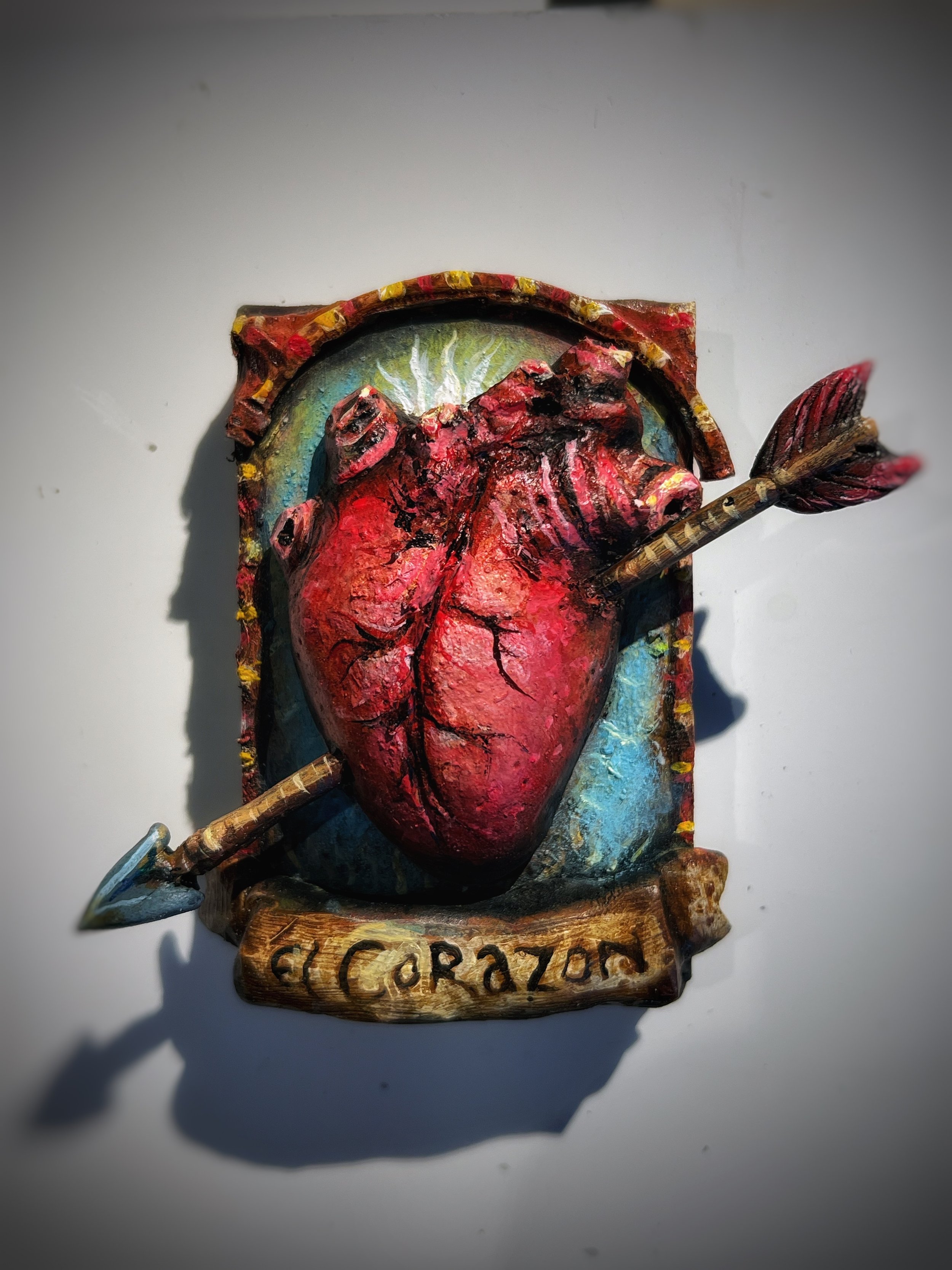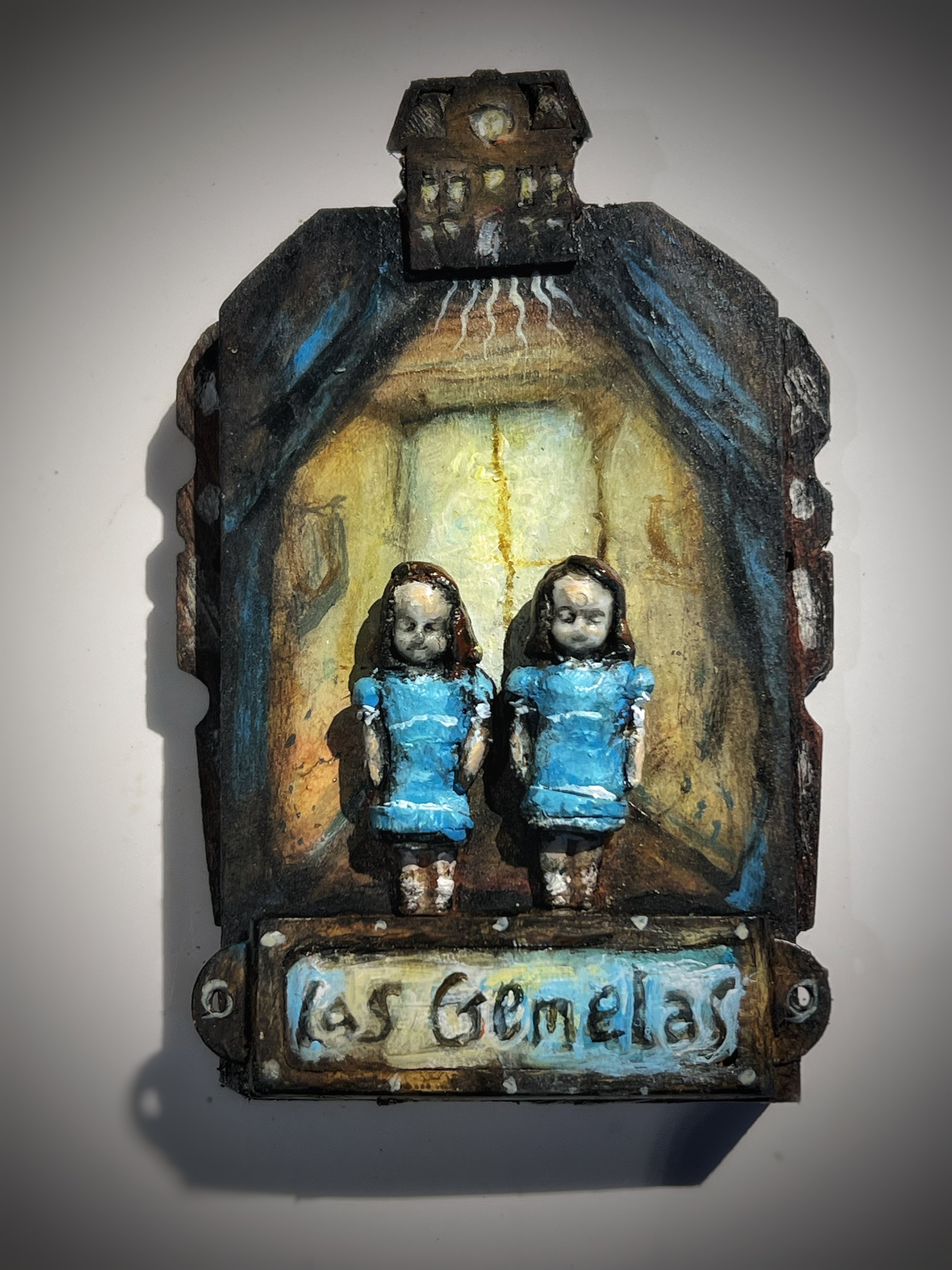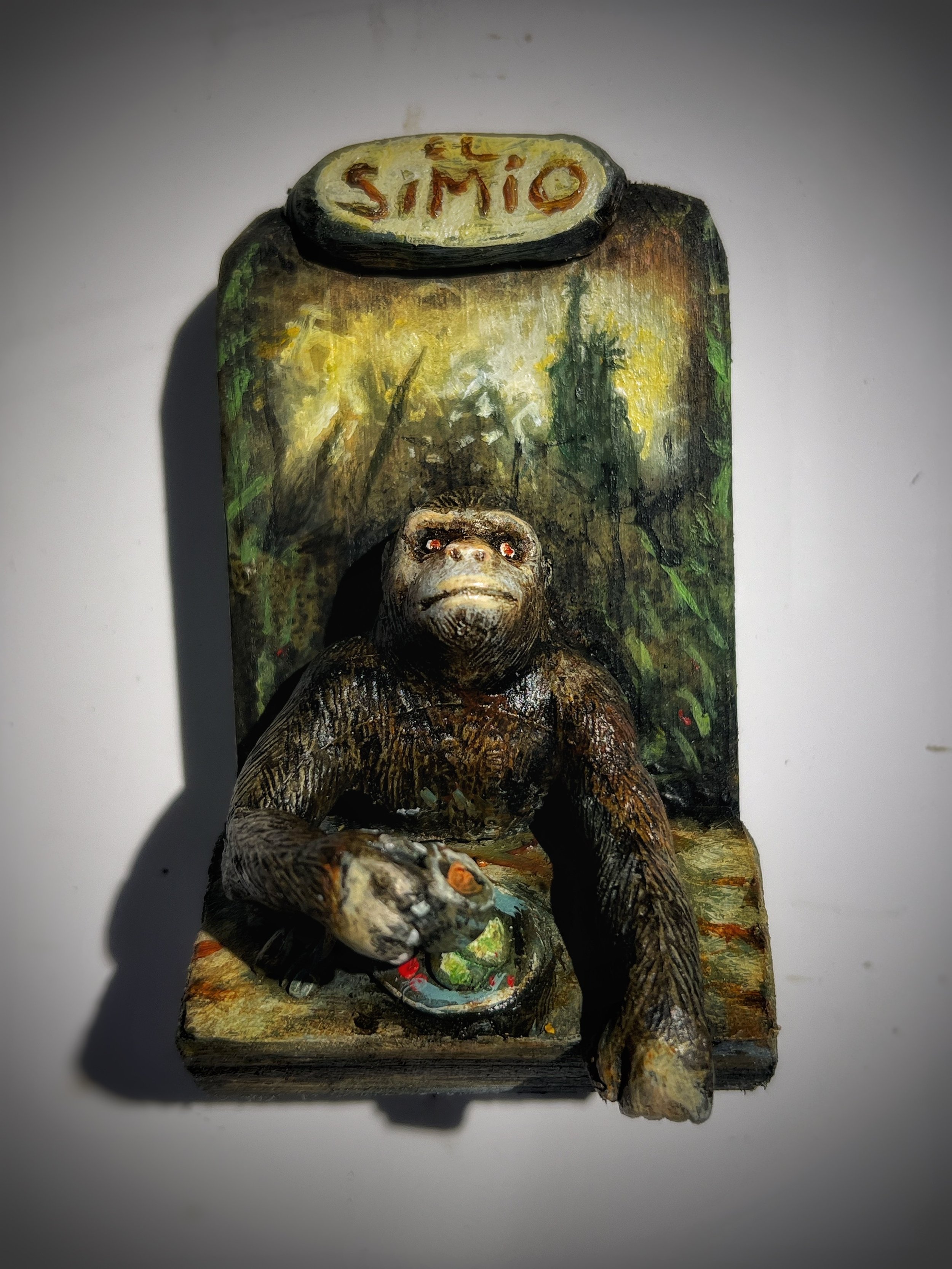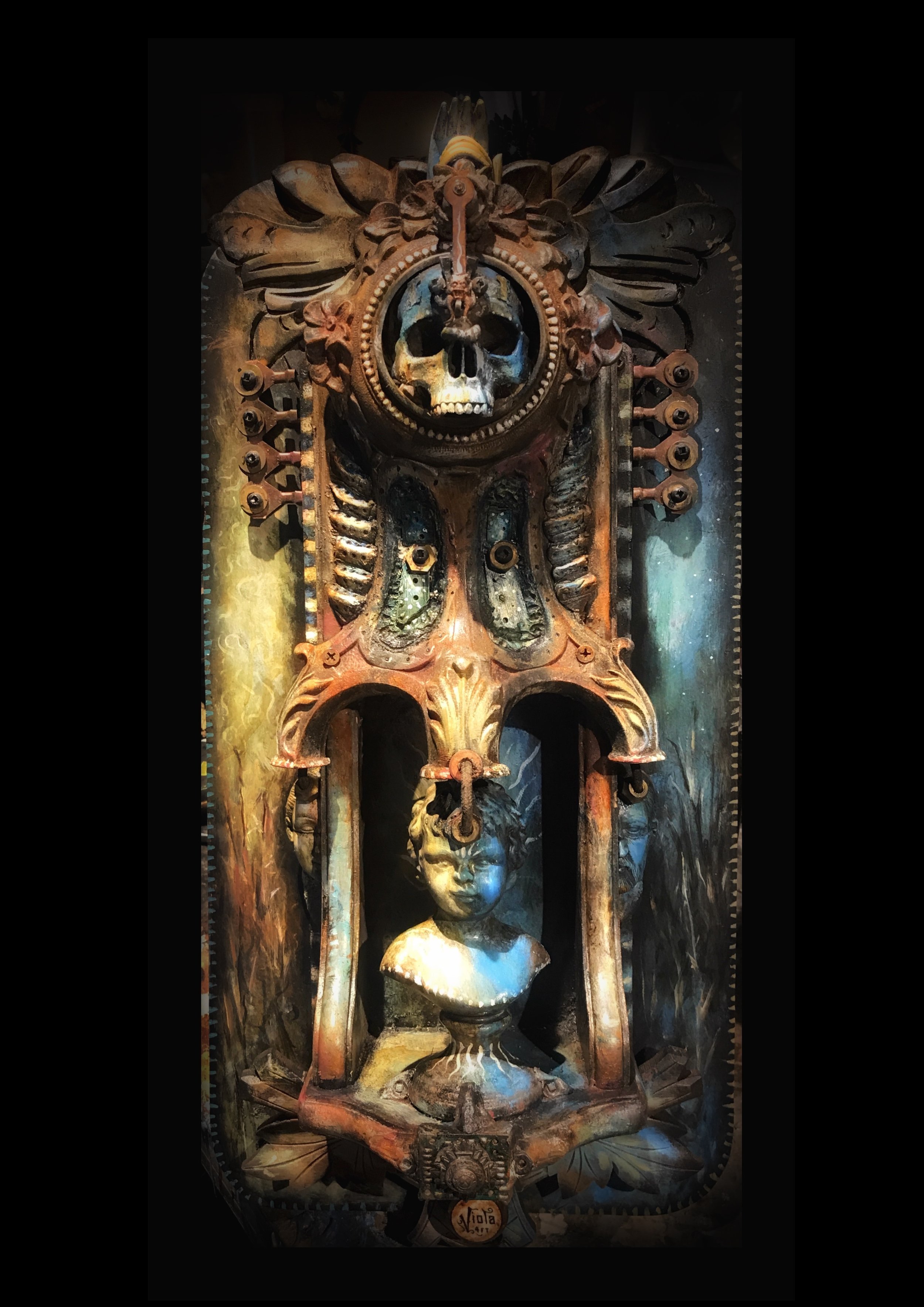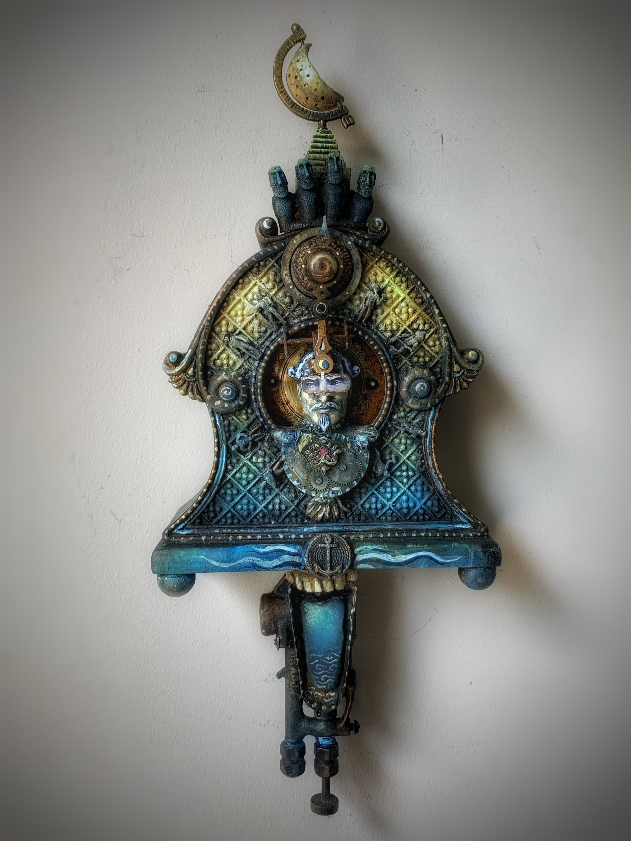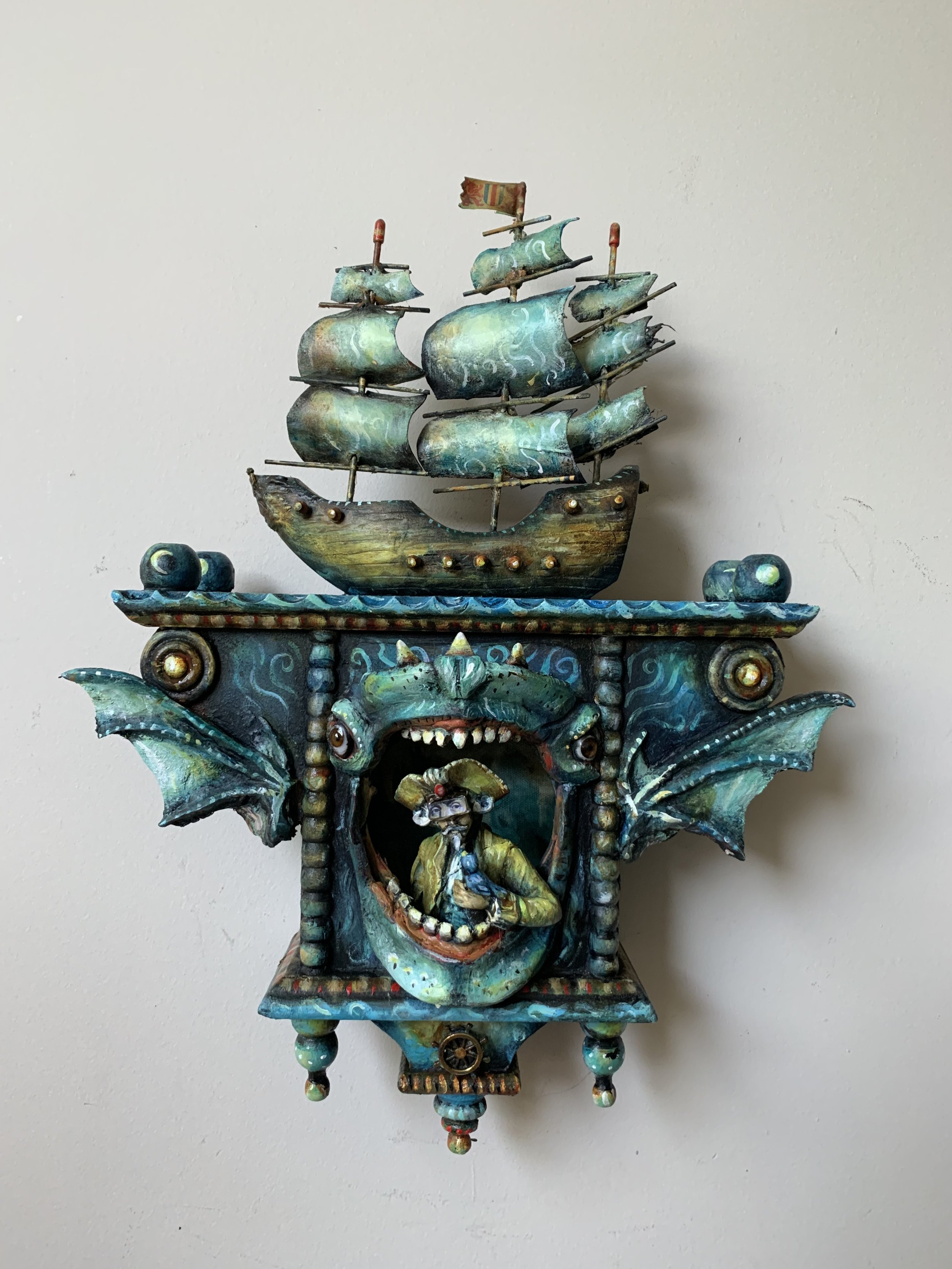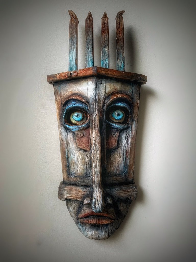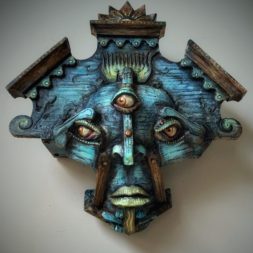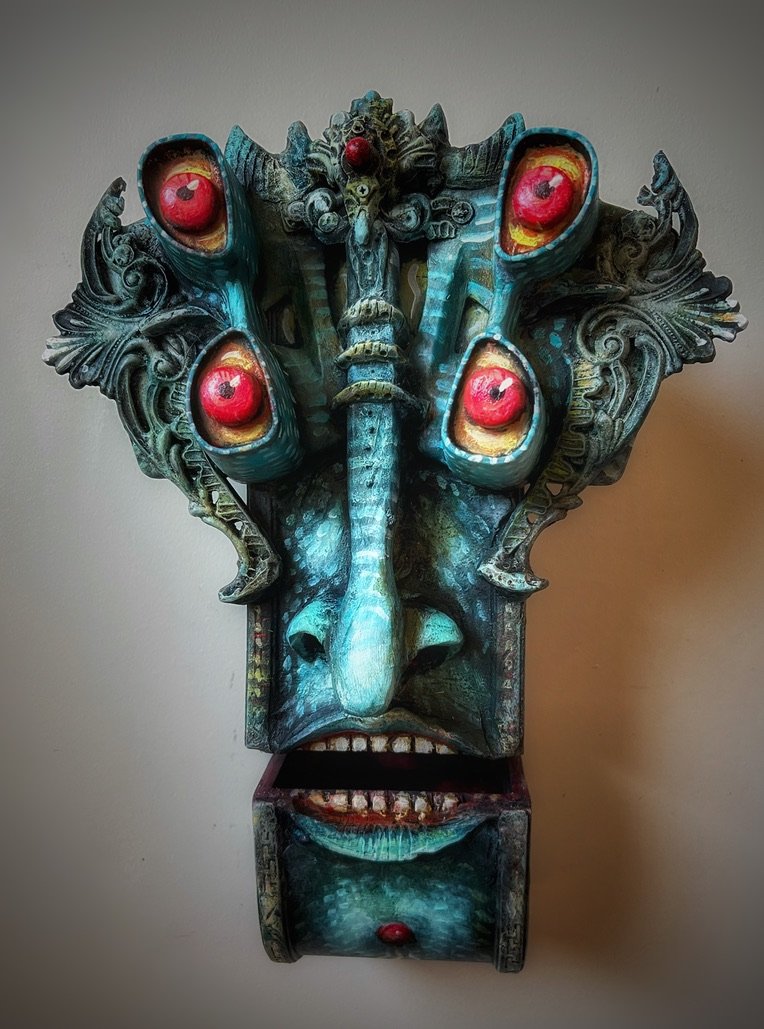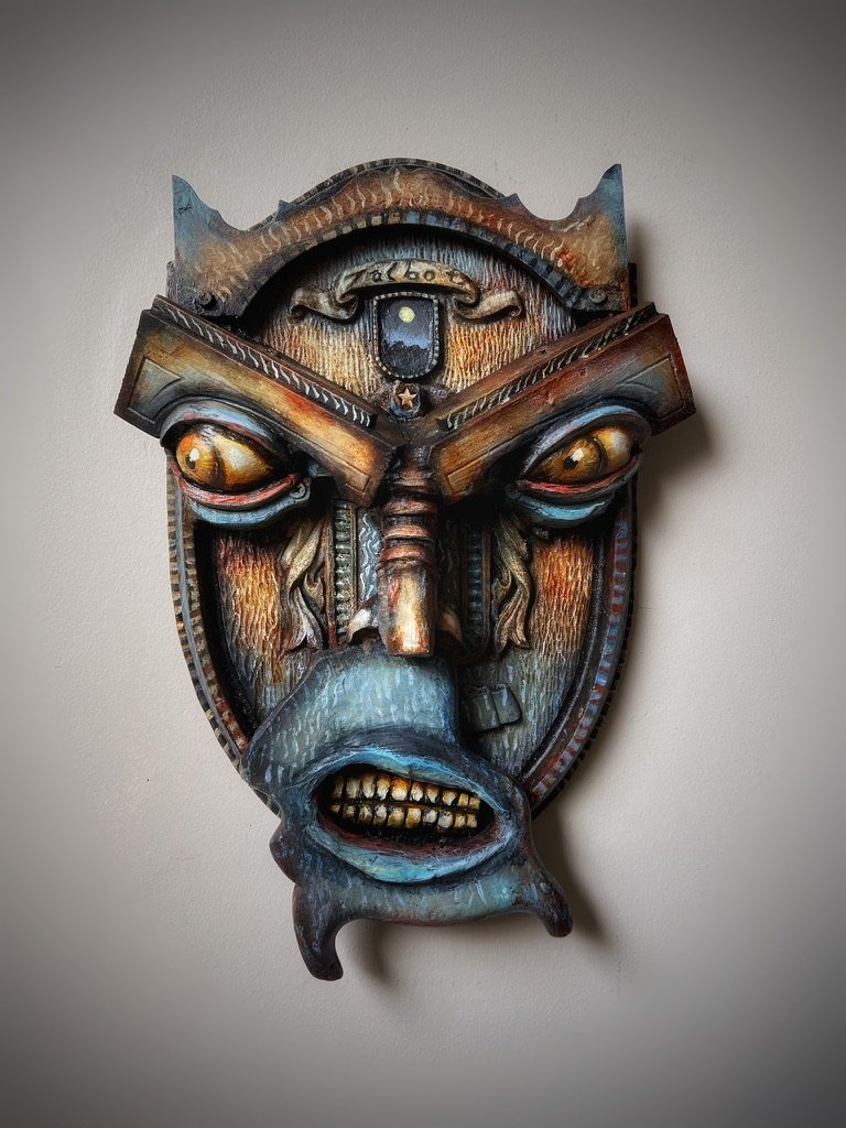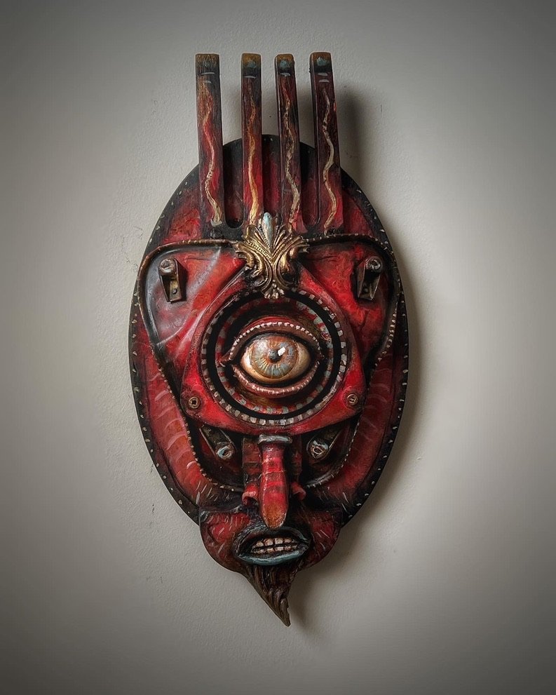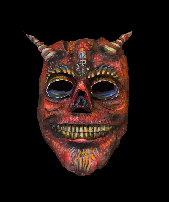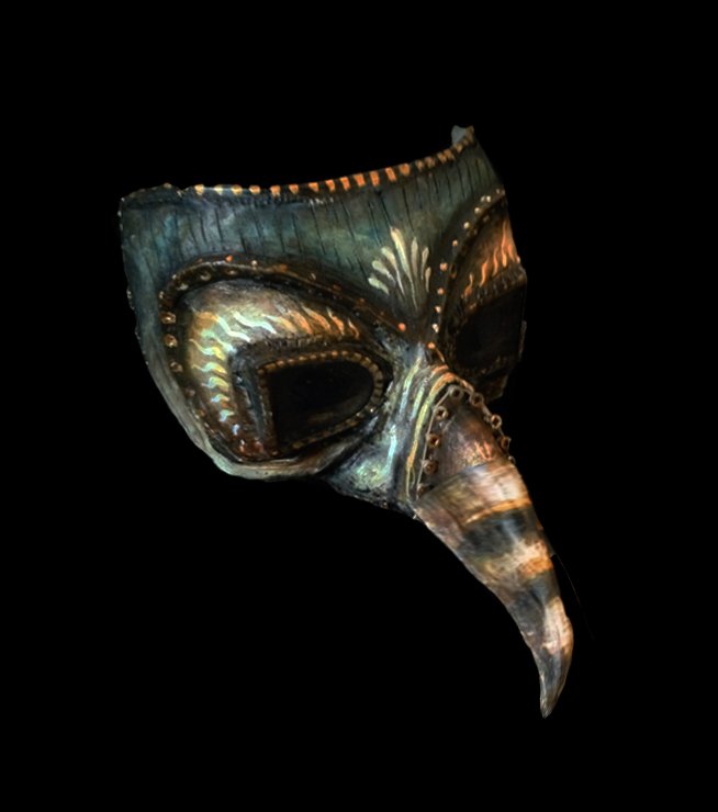
You don’t really know your art supplies until you’ve tried to build a shrine out of driftwood, a baby doll arm, and two rusty keys—with a dozen curious students watching, the clock ticking, and your paintbrush shimmying over unfamiliar surfaces.
Just another day for me….
Here’s the thing: no matter how organized the space or how well-behaved the glue, you still need materials that show up. Paint that doesn’t crack, fade, flake, or suddenly turn the color of disappointment. You need paint that doesn’t suck.
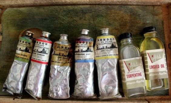
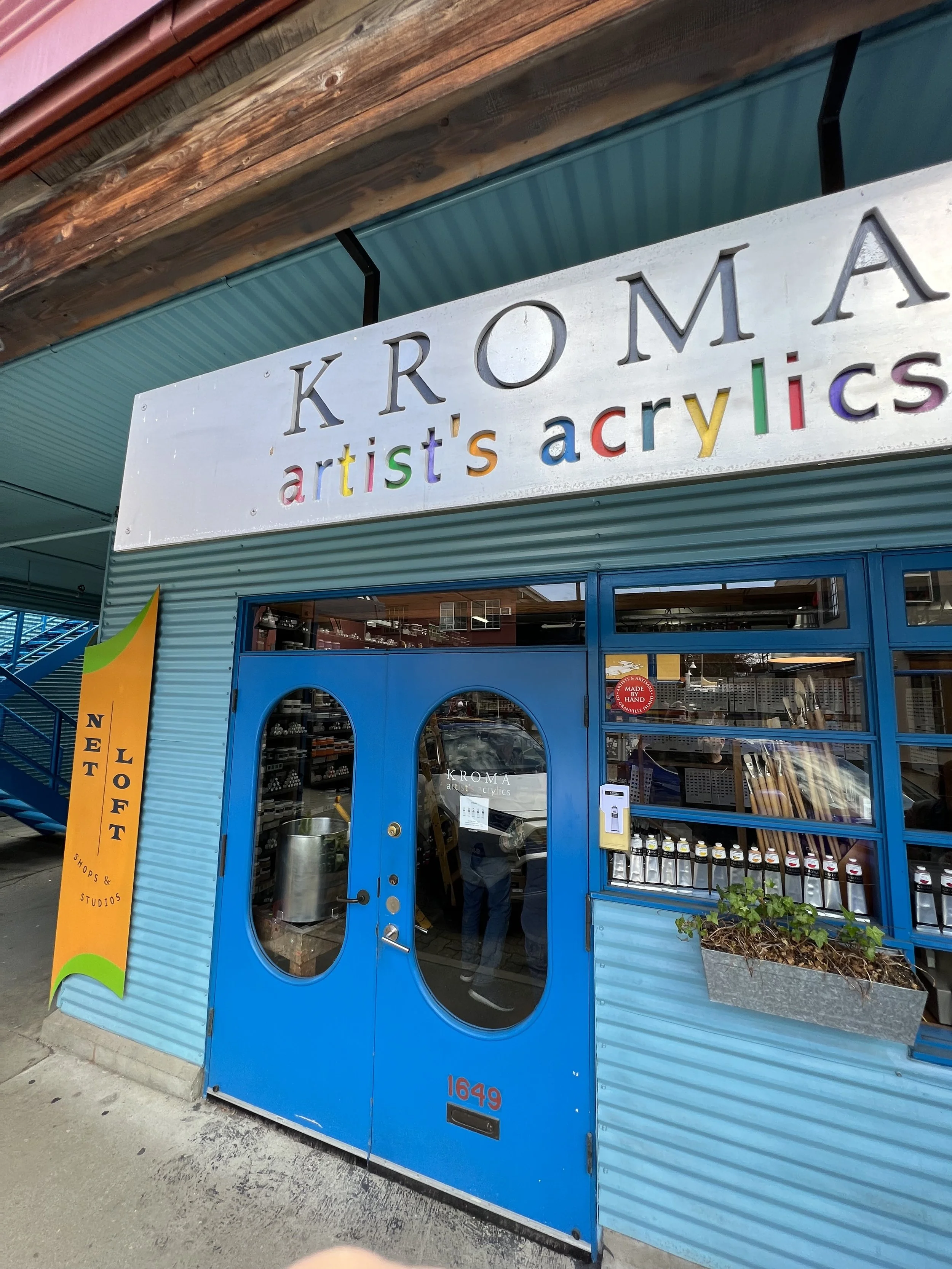
Enter: Kroma Acrylics.
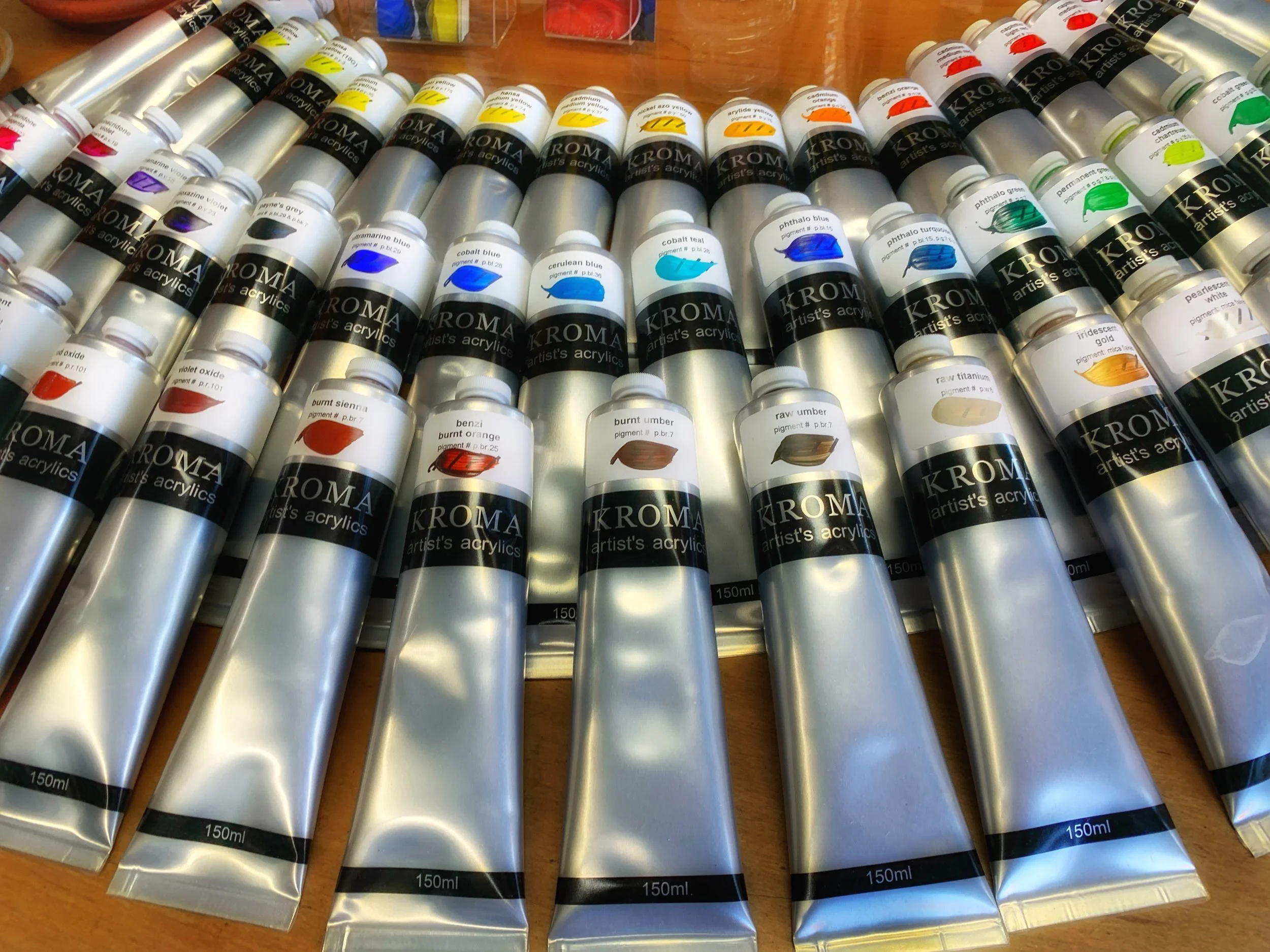
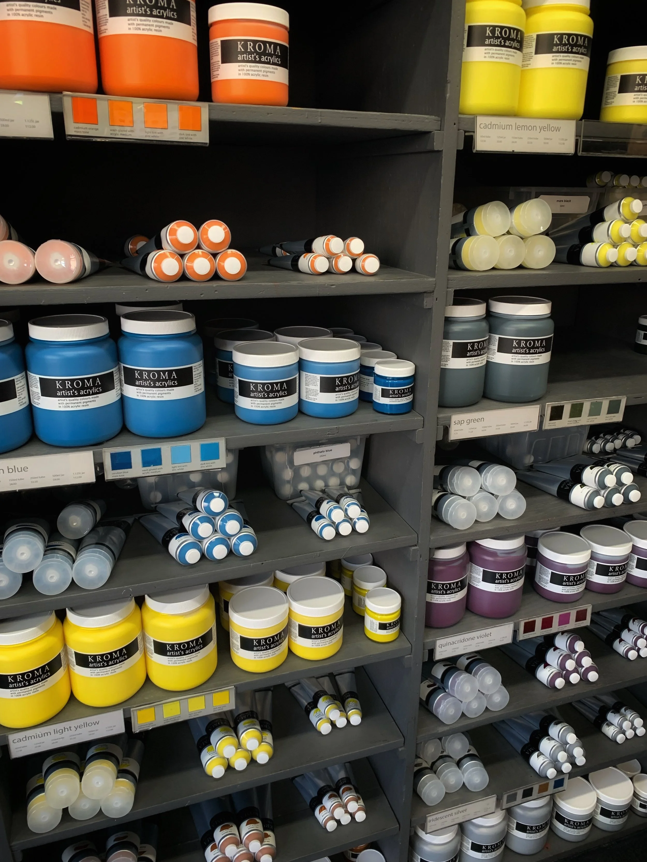
Now, I don’t usually get evangelical about my supplies (unless I’ve had two mezcals and someone casually insults matte gel medium). But Kroma? That’s different. These paints are made—by hand—in a small studio on Granville Island, right here in Vancouver. No filler. No mystery binders. No pigment pulled out of a Crayola crime scene. Just rich, vibrant, lightfast color mixed with actual care by actual humans.
And that matters.
Because I’ve tried the cheap stuff. We all have. You’re halfway through a demo and someone pulls out “Lemon Sunrise Yummy Yellow” that looks like it was milked from a Muppet. The kind of paint that dries three shades lighter and feels like regret.
Kroma paints, though? They stay true. They behave. They want to play nice with your washes, your glazes, and in my case, all the layers of grit and grime of my found object substrates.
And the ethics? That’s part of the magic. They don’t cut corners. Their pigments are sourced with an eye toward safety and sustainability. Their packaging is thoughtful. Their team is small but mighty—and they give a damn about what they make and who they make it for. This isn’t some factory-churned sludge. This is small-batch brilliance with a West Coast soul.
Some of my forever-faves?
· Benzi Burnt Orange – Earthy but electric. The color of oxidized joy.
· Transparent Red Oxide – Like rust made poetry. Glazes like a dream.
· Cobalt Teal – Oceanic and mysterious. The siren song of pigments.
· Vancouver Grey – Moody, quiet, and cool as a foggy stare.
· Cadmium Chartreuse – Loud in all the right ways. Toxic in the best possible sense.
· Quinacridone Red – Think velvet heartbreak and opera curtains.
· Phthalo Blue – Deep, wild, and just a little unhinged.
· Dioxazine Violet – Regal and witchy. Perfect for haunted shadows.
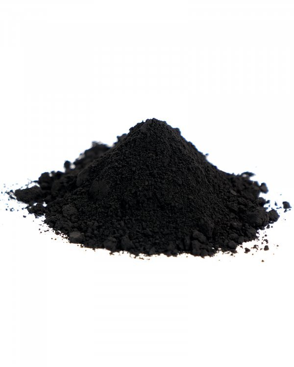
· Carbon Black – Black that means it. The full eclipse of pigment.
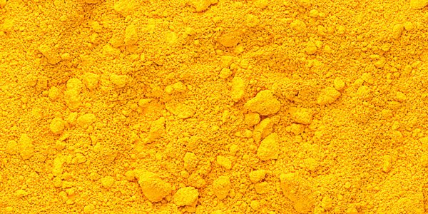
· Arylide Yellow – Warm, friendly, and surprisingly sly.
And that’s just the shortlist.
So here’s my unsolicited advice, fellow junk-art conjurers: treat your paint like you treat your tools. With respect, curiosity, and a little bit of reverence. Go for the good stuff. The stuff with a story. The stuff that’s been mixed, tested, and bottled by folks who actually care what it looks like after it dries.
Because life’s too short—and art’s too weird—for bad pigment.
And say “Hi” to Niko if you stop in.